Logos are fun in my line of work. One can see the good, the bad, and the extremely ugly. My, oh my can they be ugly. Here’s the thing…logos are your image. It’s the first thing people see. You need to establish yourself and set your business apart from your competition. The logo is the number one thing that should be looked at when branding your business or product.
Let’s say that you have the best product or service. You have killer testimonials that have the competition eating your dust. Now here’s the kicker, you have a crappy logo. Your competition is by and far going to out sell you.
Why, you ask? Here is the simple and short version. When people see a logo for a product that is completely off from what they expect from the brand, they’re going to pass it over plain and simple.
What Makes A Good Logo Design
Logos come in all colors, shapes and sizes. Too big and you could have a giant mess of logo on your hands. Too small, well, you don’t want to go too small. Trust me. The key to a good, if not great, logo… simplicity and something that is going to catch your potential customer’s eye. Each business must have a logo with a hierarchy that works well with the brand as well.
Think back to some retro logos. There was a time and a place for them, however, they are now obsolete. The styles have changed and they no longer work with the current customer base.
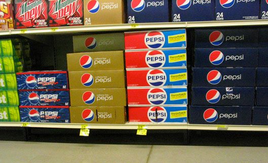
Being a child from the 80s and a Pepsi drinker, I like to look back at the Pepsi logo and see how that’s changed. If anyone was born prior to the mid 90s, they would’ve seen a couple different looks to the Pepsi logo. One may even remember that interesting Crystal Pepsi…not ashamed to say I was a huge fan and couldn’t get enough of it. Actually wish Pepsi would bring it back. However, I don’t want to get off topic here…
Pepsi’s new logo really fits the modern approach. They made sure it was a logo that sticks to its previous forms however has an updated message to it. Pepsi wants to go forward in their efforts, not backward. Unless of course you’re looking for a Pepsi Throwback. Then by all means, #throwback it is!
photo credit: Andrew Turnbull
How About We Sum It Up
Okay, so I have a tendency to ramble on a bit. I promise I don’t try to do that. Logos are a really important deal to me. We as marketers and creative professionals need to make sure that we have the means to create logos that last.
Logos are the best way to brand your businesses too. Even if a person can’t read, they can associate your brand with your logo. Think of it in a sense where if you are targeting children, they may not be old enough to read but by golly, they sure as crap know who you are and why they need to have what you’re selling.
So, let’s keep our ideas fresh, work clean and create beautiful logos that people remember. And while we do that… take a gander at this classic #throwback commercial for Crystal Pepsi.


