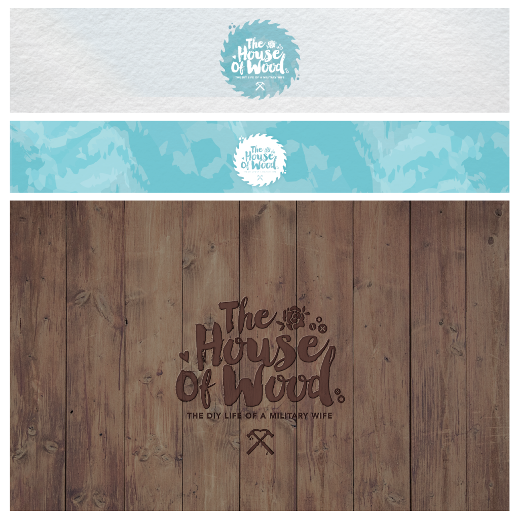
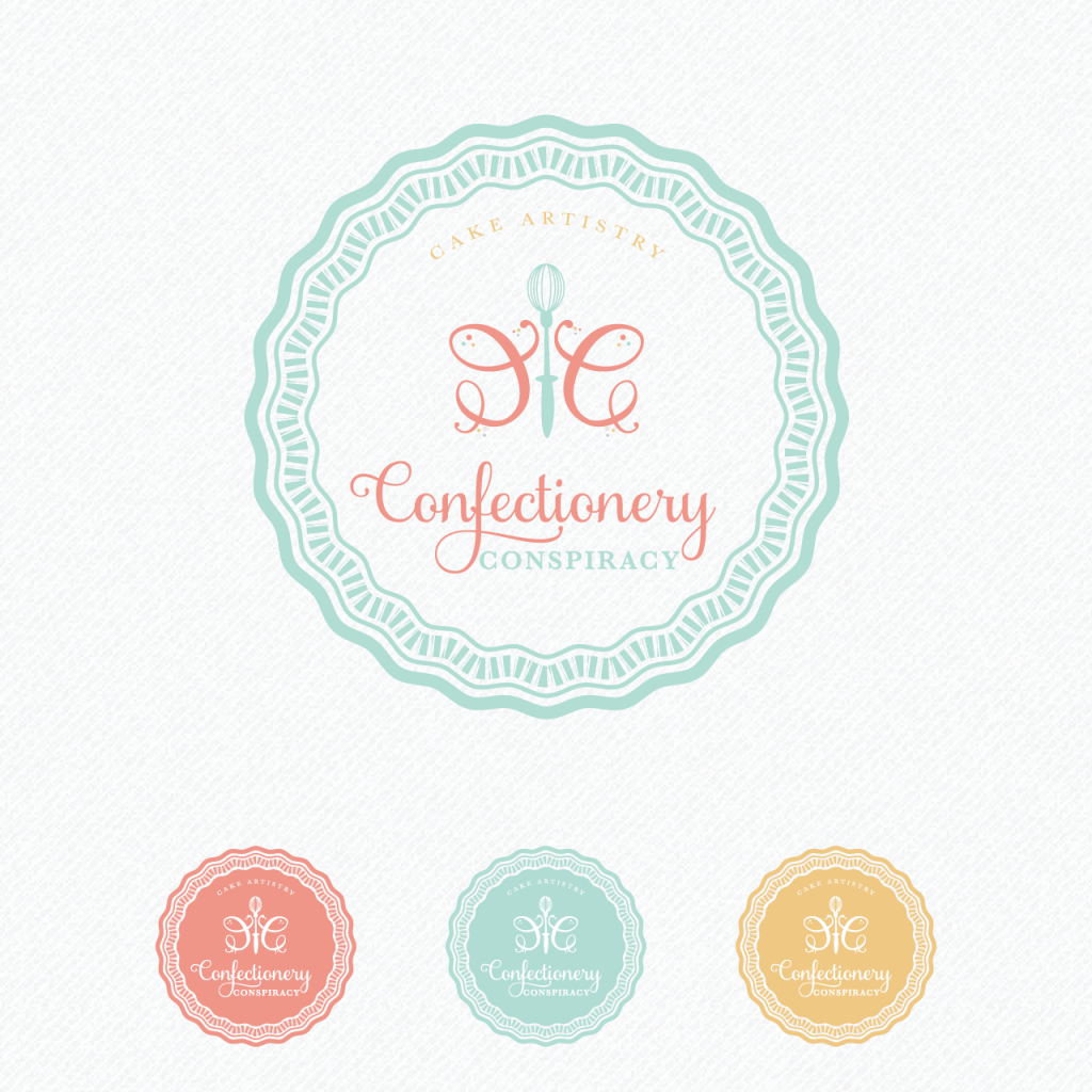
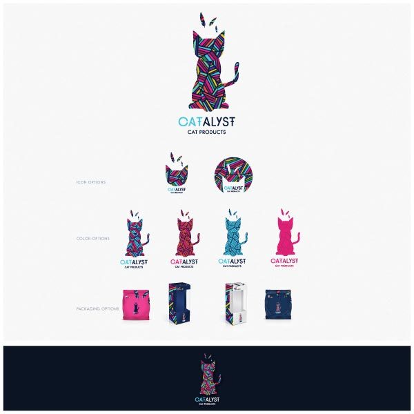
It’s a big day here at #GemNation HQ! I’m thrilled to introduce you to our September Shine Expert, Katell Schmitz, the owner and creative director of Reverie Lane Designs. As soon as I saw her website, I instantly feel in love with the style and quality of her work – I just knew she was someone I had to share with you guys! Keep reading for juicy tips from Katell on why being different is a good thing, the importance of visual consistency for your brand, and her secrets for getting through a creativity block.
If you haven’t joined Gem Nation yet, become a VIP today to receive a one-on-one branding consultation with Katell, access to the Guide to Shine: Branding Edition Workbook (coming soon), AND to participate in our Clean Up Your Brand Challenge (details announced shortly).
Tell us a bit about your business and how you got to where you are today:
Reverie Lane Designs is a brand identity styling business. Back in France, I went to school for Cultural International Project Management and graphic design was one class of the whole program but that’s all it took for me to fall in love with it. I’ve always been captured and obsessed with creativity of course and helping brands create their visual identity is the perfect cure to my obsession. For me, the business side started five years ago when I moved to Boston. I began freelancing and working for others before I realized I wanted to create my own brand and share my own philosophy of brand styling and not just design a logo here and there.
What habits helped make you successful?
I believe my success comes from two places, my passion and ambition for my business/brand on one end, and my genuine devotion to my clients and their brands on the other. I created a brand with my ideal client in mind that I absolutely love and have a clear vision of where I want to take it. I truly care for the clients I take on and feel honored to get invited along on their entrepreneurial journey. It’s what motivates me and fuels my success.
What makes your work stand out from others in the industry?
To answer this I have to point out that it has taken me a long time to accept that I was different from the others in my industry and that I actually loved being different. For female designers, it is often expected for us to have a certain design style and that style should be girly, fluffy and cutesie. I believe every designer does have a particular flair and touch, but I believe even more that as a designer I am to put my set of skills and my creative eye at the service of the brands I work with. It becomes a unique and innovative work of collaboration that couldn’t have happened with two other people. I strive to create a tailor made brand identity with each client that will make them stand out instead of blending.
Why is visual consistency so important for a brand?
We all crave stability and consistency naturally. In some form, we all need the bedtime routine, the three meals a day, the holiday seasons, set standards and bondaries in relationships, etc. Well, brand consistency is in a way the same thing. For people to invite you in their lives they want you to be a sure thing. They want to always be able to recognize you, they want to know what your standards are as a brand; they want to be able to find you when they need you. Consistency for a brand shows intentionality and confidence which will resonate emotionally with your ideal audience as you target them. Brand consistency creates loyal customers that eventually ‘sell’ for you through your branding.
What elements make up a great brand visually?
A good brand is simple visually but complex and intricate conceptually. It should leave your audience stunned and wanting more without confusing them. Type and colors are key elements in a great visual brand, since so much can be conveyed through those two elements. You want people to know who you are and what you are selling (product or idea) and feel emotionally connected to it. If your brand can easily, visually achieve that, you’ve got a keeper! It’s more than having a pretty font or perfectly paired color combination, it’s about capturing the essence and personality of your business. Think of good branding as a visual hook, elements that put together reel in your ideal client right where you prepared your best copy, catching marketing strategy, and unique products.
What are a few well-known brands that you think have strong branding and beautiful graphics?
There are so many who do it so well, it’s hard to single out anybody. Apple definitely would have to be mentioned. Their clean minimalist branding is extremely effective and has set such a standard of quality and innovation in all our minds If you have ever bought anything from the Apple store you probably have felt this way: “ I don’t know what is about to happen when I open this box but I know it’s going to be mind blowing and I am going to have a great experience no matter what.” A brand that makes you feel that way has good branding! As far as great graphics, here is a completely arbitrary and subjective list – some more well-known than others – Chipotle, Halo Top, Mast Brothers, Sugarfina, Moo, Woven Pear, to only name a few. And of course Reverie Lane Designs, not well-known but I’m working on that! haha
What do you wish your clients knew before starting a project?
I wish my clients knew who their ideal audience was before they came to me. It’s one thing to have a vision for your graphics, it is another to know what is going to speak to your ideal client. It’s so important to think this through.
What is your strategy for handling difficult clients?
I don’t think I have a set strategy as every client is different and their reasons to be difficult are also different. However I do have a golden rule when it comes to managing clients and difficult situations, I never want any client to walk away feeling like I didn’t give my all to their project. It is always my intention to create the best possible work and experience for my clients, and if there is anything standing in the way of that, I strive to work with them to make sure we get through it. And I think the key to that is open and honest conversation throughout the entire process.
What is your biggest graphic design pet peeve?
My biggest pet peeve when it comes to graphic design is seeing branding or logos that actually hurt the business but everybody seems to be praising it. Branding that looks outdated, that has blinding neon colors put together, ineligible or stretched out fonts, etc…is not good design and will hurt your business.
What do you do when you have a creativity block?
I actually just wrote a blog article about the different types of breaks that help when I feel stuck creatively or burnt out from overworking. I usually try to either change my medium (computer to paper for example), change my workspace (different room or even different location altogether), change my project (work on something else that inspires me at the time) or finally change my activity (stop working and play with the kids or watch a show for example). Sometimes the best thing to do is simply to stop thinking about it and stop trying so hard. Take a couple days off, focus on your personal life, get distracted. That will refuel your energy and your inspiration tank.
What’s the worst business advice you’ve ever received?
The worst advice I have ever received I would say would be “don’t try to get too big.” I couldn’t disagree more with that mentality. Firstly because what is ‘too big’? We all have different concepts of success and have different definition, as we should, of what’s ‘big’. Secondly because if you don’t reach for the stars you certainly will never touch them or even lift off the ground for that matter. Ambition should not be limited. It is certainly costly but also rewarding. So go for it, go after YOUR ‘big’, you will never be disappointed doing it even if you don’t quite make it, because you tried.
What advice do you have for other entrepreneurs balancing a startup and little humans?
I unfortunately don’t think there is a set formula – unless I have yet to find it – but the one thing I have to say is to create somewhat of a flexible routine to manage the ‘organized chaos’ that it is . I have also found that it is better to stop and fully pay attention to my kids even for just an hour or two when they seem extra needy, instead of saying ‘no’ and keep working with them asking for me the whole time. Because who are we kidding, the work in those situations isn’t quality work and the kids will end up frustrated from constantly being pushed away. No good on either front.
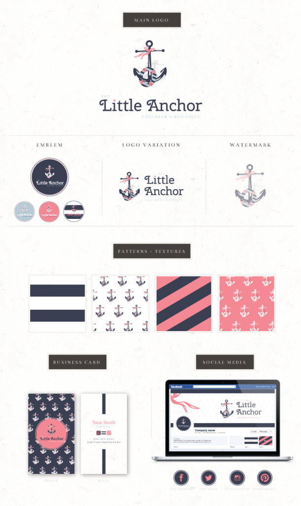
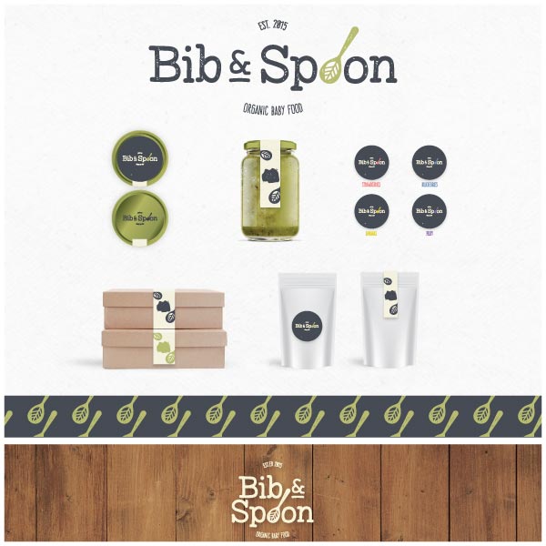
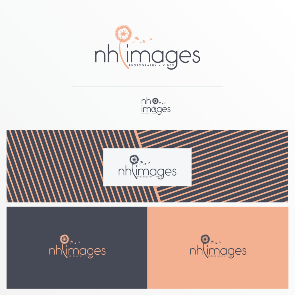
All images are courtesy of Reverie Lane Designs.

