

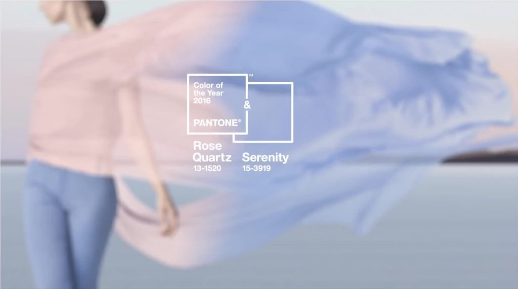
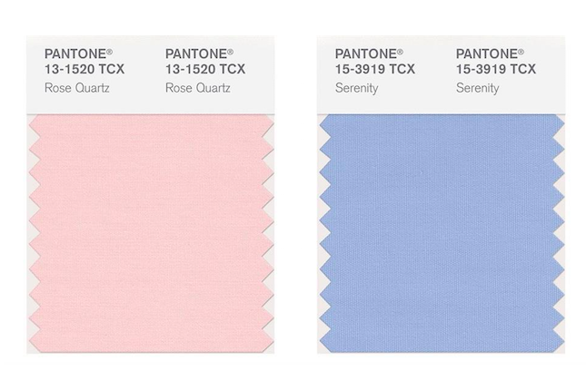
Every year Pantone announces the “Color of the Year”. Well, this year they threw us all for a loop by sharing 2 colors with us! Then, we thought we heard it all- the gender equality angle, the hot fashion angle, and of course the baby reveal jokes!
Don’t panic, there’s still hope for all of us! These colors can actually be beneficial to your business if you use them properly. According to Pantone, the colors were selected as a reminder for us to seek “mindfulness and well-being as an antidote to the stress of modern day lives.”

Veronica Linette, President of Red Stitch Clothing says, “Pantone colors and the color(s) of the year set the tone for designers and fashion trends to express the time in which our culture is living in. With that said, in order to become a market leader in the fashion industry and when shopping for my boutique it is important for me to follow the forecasting color trends that Pantone puts out and to find unique styles at an affordable price point.”
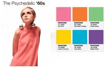
If you were to look back at the colors for previous years, and the time period, you will almost always see the connection.

“My customers are very savvy, fashion forward and always want to rock the latest styles and therefore, it is very important for me and for my business to follow and be inspired by the yearly colors that Pantone puts out. For me it is the Holy Grail and the fashion bible, without it I’d be lost!”- Linette states.
You can incorporate Rose Quartz and Serenity into your office for 2016 to give it a new energy. 4th Generation Psychic Medium and Color Expert, Linda Lauren says, “Using this particular shade of blue will promote calm communication in an office and is a perfect color for a conference room or reception area, while Rose Quartz will afford you a feeling of accomplishment in business and reward you with positive feelings. Set the tone in your private office with accents in this color.”
I plan to implement the colors in Bijouxx™ Jewel’s 2016 line in both colors for our new jewelry and handbag variations to ensure that we are on trend. Our customers will have both options and we’ll let them decide which one fits them best.
The way we will implement the Pantone colors with The Cookie Cups™ is to use these colors for flavor creations. The Rose Quartz appears a lot like I would imagine a “Pink Lemonade” Cookie Cup would look and even taste. Soft with a sweet, tangy punch! Serenity for me, would be a great fit for something like a “Blueberry Pancake” Cookie Cup with just enough hue to give it that blueberry look accompanied by a surprise hint of Maple Syrup to taste.
You don’t have to shout that you’re using these colors from the top of your office roof. Implementing them subliminally into your branding, packaging, and overall product development will subconsciously remind your clients and customers that you are on trend and on top of your industry.
How will you use the Pantone Colors of the Year in 2016 in your brand?